Measure your product strategy - a new learning for analytics setups
An interesting discovery
I decided to take on an interesting challenge: creating one tracking plan every day for a week, with plans to continue for three more weeks. The goal was to create 20 tracking plans for common startup tools. I chose these tools because people are generally familiar with them, and they cover different product directions. This means if your product overlaps with any of these tools (like Notion), you can find useful inspiration.
One of my biggest worries was that it would get monotonous quickly. I didn't do extensive prep work - while I had a list of tools I wanted to cover, I didn't map out specific approaches for each one like "for Notion I'll do X, for Slack I'll do Y." Instead, my process was simpler: each morning I'd set up my recording, open the tool's website, and think through the core use cases I wanted to focus on. Then I'd create a first draft using Claude.ai and my book as context, and iterate from there.
I chose this approach because I wanted to give real insight into my thought process and design decisions when building analytics setups. Sure, I could show you hundreds of examples of initial analytics setups - which events to track, how to structure properties - but that would miss the interesting part: the decision-making process. We're talking about design here, not math. There's rarely a clear right or wrong answer; it's about balancing tradeoffs and making thoughtful choices.
After recording the first two (Notion and Slack), I worried I might end up repeating myself. With both tools, I focused heavily on core features. This worked well for Notion since it has so many different directions - focusing on core features made it approachable. I took a similar approach with Slack.
But something interesting happened when I got to Superhuman. Being just an email tool, its core functionality is quite focused. So I started thinking differently: what if we built analytics around Superhuman's original core promise of achieving "inbox zero"? While Superhuman has evolved since then, using this historical angle created an interesting perspective.
This led me to develop a two-bucket approach to analytics setups:
- Core Functionality: Cover how people actually use the product
- Strategic Direction: Track metrics that reflect the product's strategic goals and unique value proposition
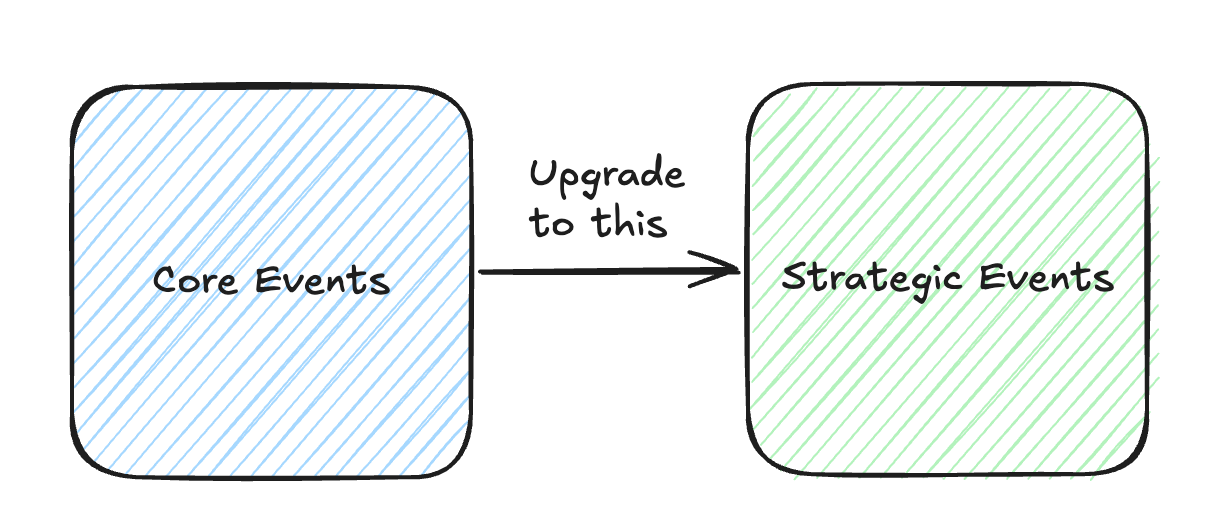
If product strategy is crucial (which it is), it should be reflected in your data. You need the right metrics to show whether your strategy is working.
I continued evolving this approach through my final video of the week on Asana. I examined their current positioning beyond just task/project management and built an analytics setup that covered both core functionality and strategic direction.
This was a valuable discovery for me. While I'd sometimes done this implicitly before, making it explicit improved my approach significantly. I plan to keep using this method and wanted to share it because I think it could be valuable for others working on analytics setups too.
Core is great, but ...
But what do we really mean by "core features"? Let me use Notion as an example, since it's what inspired this whole journey.
At first glance, Notion seems simple - just a page where you write stuff. But dig deeper and you'll find it's a massive tool. You can add databases, tables, charts, link pages together to create content hubs, even build entire websites. The possibilities are endless.
If you tried to track everything, you'd end up with an overwhelming tracking plan - maybe 60-80 events spread across 10-15 different entities. And when everything sits side by side with equal weight, it becomes hard to see what really matters.
One of my biggest breakthroughs in working with event data was developing proper clustering. That's why I introduced the concept of product layer, customer layer, and interaction layer as the double three-layer framework.
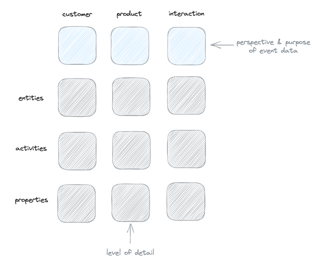
This hierarchy isn't just organizational - it guides you on how to use each layer. It makes the whole system more approachable and practical.
When you're faced with something like Notion's 20 different entities all competing for attention, it becomes really hard to manage. My approach? Take a few steps back and look at the bigger picture. What are the absolute essentials?
For Notion, it boils down to just three things:
- Workspaces
- Documents within workspaces
- Accounts
These are the fundamental building blocks. And here's the key insight: the document is Notion's heartbeat. As long as people are creating and expanding documents, the product is healthy and being used. If you had to pick just one thing to track in Notion, that would be it.
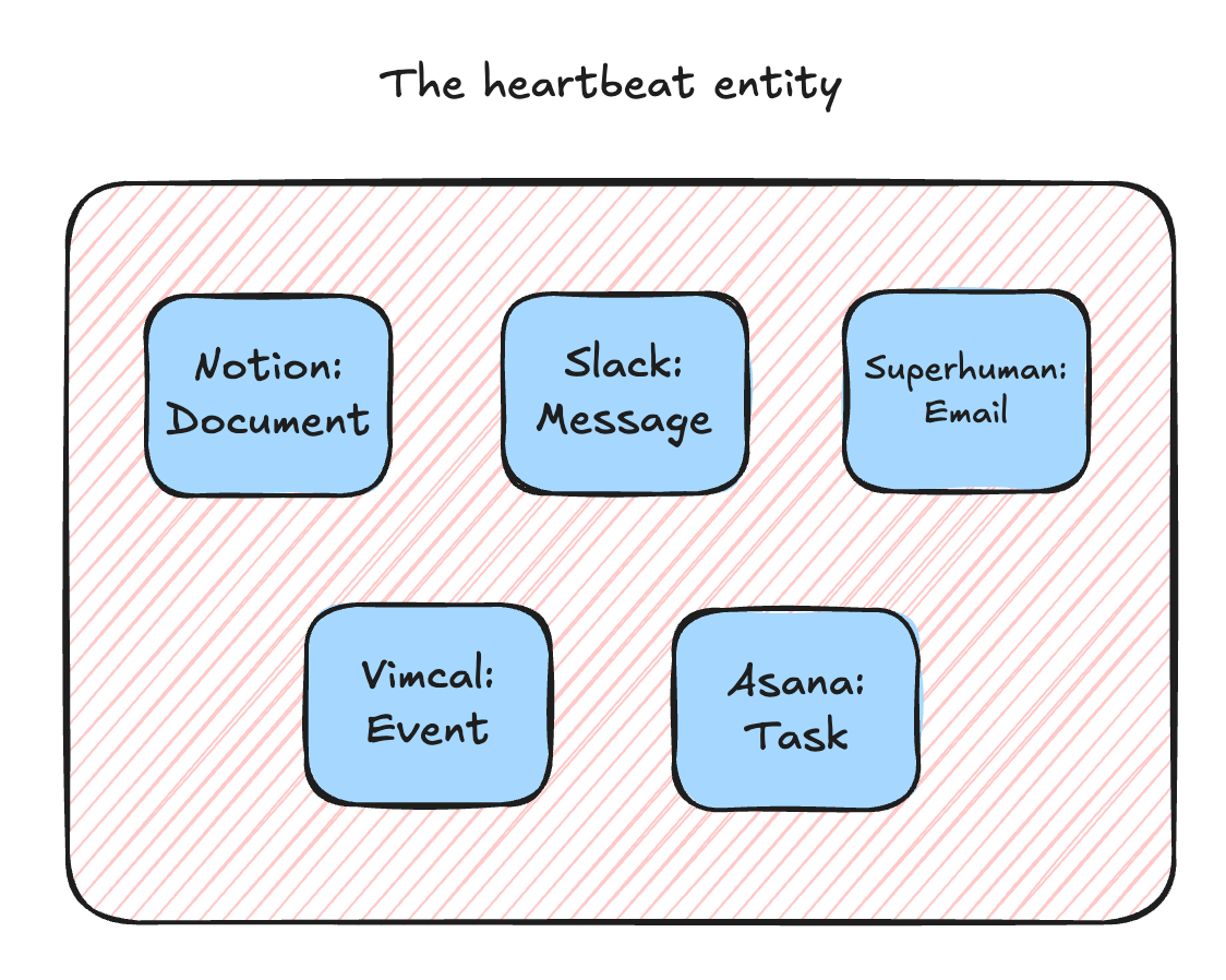
This concept of finding your product's "heartbeat" - which emerged over the week - is really powerful. Every product has one:
- Notion: documents
- Slack: messages
- Superhuman: emails
- Vim Core: events
- Asana: tasks
As long as these keep flowing, your product is alive and well.
Sure, you can (and should) look at variations and patterns for deeper insights. You can add different angles and metrics. But when you're starting out with analytics, especially if you're feeling overwhelmed, start with identifying your product's heartbeat. Get that foundation solid, then layer your product strategy on top of it.
The product strategy
Once you've defined the core, you can explore product strategy. Let's take Superhuman as an example. Their core foundation is simple: emails, accounts, and email accounts. If you just want to track basic usage, that's all you need.
But the interesting part is understanding if you're delivering your unique value proposition. Superhuman did something bold - they launched a subscription-based email client. When they started, this was practically unheard of. They were essentially saying, "We add so much value to your workday that you'll happily pay $30 monthly." That's a strong claim that requires delivering real value.
Their early strategy (which has evolved since) was laser-focused: "We'll build the best email client for achieving inbox zero." Everything was optimized around this goal. I actually went through their onboarding process back then - it was mandatory and personal, which I usually hate, but it made sense because they needed to demonstrate their unique approach to how to get to inbox zero fast.
They built specific features to support this strategy:
- Heavy emphasis on keyboard shortcuts (perfect for power users like me)
- Reimagined email triage - instead of the traditional three-column layout, they simplified it to just a list view for quick decision-making
- Smart features like email snoozing - letting you temporarily remove emails from your inbox without losing track of them
When designing the analytics setup for Superhuman, I made sure to track these strategic features. Beyond basic email activities, I added specific tracking for things like "inbox zero achieved" - a single activity that measures strategic success. This lets you analyze fascinating patterns:
- How many inbox zero streaks do users maintain?
- How quickly do they reach inbox zero each day?
- How often do they achieve it?
I applied this same strategic thinking to other products too. Vimcal was trickier - they position themselves as "the calendar for people with lots of meetings." I translated this into analytics by focusing on efficiency features like their booking link system, which eliminates manual calendar entry overhead.
For Asana, beyond basic task management, they emphasize connecting work to goals and automating workflows. So I built these strategic elements - goals and workflows - directly into the analytics structure to ensure we're measuring what truly matters for their strategy.
How to include it in your analytics setup
So how can you apply this approach to your own analytics? There are two key steps.
First, simplify by identifying your product's core essentials:
- Find your product's heartbeat - that one critical entity that, if removed, would break everything. Not just damage the product, but fundamentally break it
- Identify the adjacent entities - usually things like accounts/users, or structural elements like workspaces that contain and organize your heartbeat entity
- Focus on the truly fundamental building blocks of your product
I use two simple tests for validating core entities:
- If you remove it, does the product still function?
- Does it have enough meaningful activities associated with it?
Strategic entities often fail the first test. Take Asana's goals feature - remove it and Asana still works as a task management tool. Or look at search in Superhuman - it only has one activity, but it's strategically crucial because of their inbox zero approach. When you're not organizing emails into folders, search becomes essential.
Once you've nailed down your core, take the second step: sit down with your product and product management teams. Have them articulate what makes your product different from competitors in your category. These conversations typically reveal one or two major strategic directions that you should build into your analytics setup.
Looking at the tracking plans for the last week
If you want to see this approach in action, I've put together a comprehensive set of resources from last week's work. I created five tracking plans, each with its own video and accompanying blog post.
The blog posts aren't just written versions of the videos - they go deeper, exploring four key themes that came up in each video. I wanted to use the written format to really dig into concepts that deserved more attention.
For those interested in the technical details:
- Check out the Miro Board for complete tracking plans for all tools
- Visit the GitHub repository to see JSON schemas for each tracking setup
Notion - core, core, core
If you want to see a perfect example of focusing on core entities, check out the Notion post. The video and blog post walk through creating a lean, focused tracking setup with just the essential events. It's a great reference for how to build a solid analytics foundation without overcomplicating things.
Slack - core and no notifications
The Slack episode continues the core-focused approach, but it raises an interesting question about what qualifies as "core." You can watch my thought process as I wrestle with whether to include notifications in the tracking plan.
Notifications are a fascinating case study. When Slack launched, they were arguably a strategic differentiator. While their strategic importance may have diminished over time, they were once a key part of Slack's value proposition. Despite this, I ultimately decided to exclude them from the core tracking plan.
Check out the video to follow my back-and-forth reasoning and see why I ultimately left notifications out of the core feature set.
Superhuman - the early strategy
The Superhuman episode marks a turning point - where I start going beyond core features. This shift happened partly because Superhuman's core functionality is actually quite simple and, honestly, a bit boring on its own.
Watch this episode to see two things:
- How to build an extremely lean core tracking structure
- How I expand beyond that to incorporate Superhuman's "Inbox Zero" strategy into the analytics
It's a great example of how to create metrics that align with and support your product's strategic goals.
Vimcal - the tricky strategy
Vimcal presents an interesting parallel to Superhuman. Like Superhuman, its core functionality is relatively straightforward. But translating its strategic value into analytics was more challenging.
With Superhuman, we had "inbox zero" - an established productivity concept they could build around. But calendar management doesn't have such a clear philosophy. In fact, conventional wisdom often suggests that having too many meetings is a problem to solve.
Vimcal took the opposite approach. They specifically target people who have lots of meetings and need help managing them effectively. But you can't just track "number of meetings" as a success metric - that would be counterproductive and miss the real value.
The key insight (at least from my perspective - Vimcal might see it differently) was focusing on reducing meeting management overhead. When you have lots of meetings, efficiency becomes crucial. This became the foundation for my analytics setup - measuring how effectively users can manage their busy meeting schedules.
Asana - Going beyond core
With Asana, I really leaned into blending core and strategic entities. After checking their website, I identified goals and workflows as key strategic elements.
I approached this in two ways:
- Made goals and workflows full entities in the tracking plan
- Added strategic properties across other entities to measure their impact
For example, I built in ways to track workflow adoption across projects and organizations. In the video, I discuss practical applications of this data - like calculating an "automation score" for teams and projects. You could measure what percentage of tasks come from workflows versus manual creation, then give teams actionable feedback: "Your automation score is 20%. Here's how you could get to 50%." This kind of metric helps teams both improve efficiency and maintain quality.
It turned out to be one of the most interesting episodes, showing how strategic metrics can create practical value for users.
Join the newsletter
Get bi-weekly insights on analytics, event data, and metric frameworks.