The Double Three-Layer Framework for Tracking Setups

It all started on a drizzly Tuesday, somewhere between the flat-pack sofas and the cafeteria (vegan) meatballs.
You just landed a fresh analyst role at IKEA, and your first orders were simple on paper: figure out how shoppers use the in-store screens. Sounds clear, right? But here’s the thing—“use” lives on several floors of the same house. Swipe to scroll? Tap to check stock? Stand there day-dreaming in front of the rug-chooser? Each layer tells a different story.
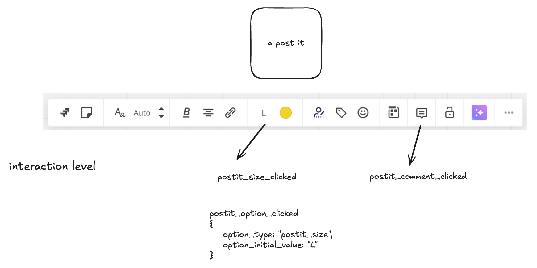
Step 1 — Spot the many flavors of “use.” - This will be essential later
Ask yourself:
- Are we logging any interaction, or only the ones that change a setting?
- Do minutes of idle screen time matter?
- What are the user's jobs here?
- How will this data help the people who actually run the store tomorrow morning?
Most likely, ninety-five out of a hundred analysts would go for the first layer—interactions—and never make it to the top floor where the strategic insights hide.
A tale of two tracking plans
Fast-forward to past project of mine. I was part of a team of excellent analysts for marketing & product analytics for a giant publishing site, swapping one analytics tool for another. They brought our team in as external consultants, and the whole project ticked all the boxes:
- Stakeholders on tap. We interviewed editors, marketers, and product managers to nail their real questions.
- A balanced tracking plan. Enough detail to be useful, light enough to maintain. Yes, we did really well with the use of properties.
- Developer buy-in. Middlewares, abstractions, tidy code and high data quality—music to an analyst’s ears.
- Training bootcamps. We showed every team where to find numbers they cared about.
By the final demo, I was sure we’d built the gold standard project. I pictured dashboards lighting up every Monday stand-up.
Reality check, three months later
I walked back in expecting a bustling data bazaar. Instead, the analysts were still crunching the same old reports, and everyone else had quietly moved on.
SEO folks shrugged: “I can see button clicks and scroll depth in the analytics tool, but my world is Google rankings. How do those connect?” In plain English, the data never hopped the fence into their daily workflow.
That little phrase—connected to my work—stuck in my head the whole train ride home. It became the seed for what I now call the Double Three-Layer Framework.
Why Click-Counting Alone Lets You Down
You spent two weeks wiring up every essential (no auto-tracking here) click, submit, and scroll inside our app—felt downright good watching those charts spike. Then the CEO walked over and asked a simple question: “So…are we making people happier or just busier?” Your screen lit up with heat-map confetti, yet you have no clue how any of these interactions tie back to real value.
Why interactions don't get you to something valuable:
- They ignore intent. A thousand “Save” clicks might mean love…or that the auto-save keeps failing.
- They disguise frustration. Rapid-fire button mashing often signals “this isn’t working,” not “I’m engaged.”
- They don’t map to value. Your business cares about engagement, churn, revenue, and referrals, not whether people changed the font size.
Think of click logs like monitoring how often a fridge door opens. You’ll know activity is happening, but you still have no idea if anyone actually ate a meal, let alone enjoyed it. Until you pair those door-swings with a meaningful outcome—cooked dinner, fed the kids, cleared out leftovers—you’re guessing at satisfaction.
One way to handle complexity is to swap the question from “What did they click?” to “What did they accomplish?” That single pivot turns a pile of UI trivia into signals of progress, adoption, and (yep) revenue.
Meet the Double Three-Layer Framework
Picture me six months after that “clicks-are-noise” epiphany, hunched over a whiteboard the size of a small planet. I needed a model that kept the business front-and-center yet still gave designers their precious UI details. After plenty of walks, three truths bubbled up:
- We’re really watching three different movies at once.
- Each movie follows three repeating scenes.
- If we mix them up, the plot makes zero sense.
That’s the backbone of the Double Three-Layer Framework.
The three perspectives (the “rows”)
|
Layer |
What it answers |
Who cares most |
|---|---|---|
|
Customer |
“Where is the user in their journey?” |
Execs, Growth, Success teams |
|
Product |
“Which feature or object did they touch?” |
Product managers, Data teams |
|
Interaction |
“Exactly what did they click, view, or scroll?” |
UX designers, Researchers |
The higher you go, the closer you get to revenue. The lower you go, the closer you get to pixels.
The three building blocks (the “columns”)
- Entities – the nouns of your product: Account, Board, Asset. Keep it to 3-7 or your schema becomes spaghetti.
- Activities – past-tense verbs that mark progresss: Board Created, Board Shared, Subscription Canceled.
- Properties – the spices: board_id, asset_type, account_plan. They add flavour without forcing new events.
Put the grid together and you get a tidy matrix—nine little boxes that map every question from “Why did churn spike?” down to “Which toolbar icon hides in plain sight?”

A Walk-Through with Miro as the Guinea Pig
Let’s put the framework to work on a concrete example: Miro. I picked it because many of us have dragged a sticky note around in there, and its feature set is deep enough to test whether a tracking plan holds up. Grab a (virtual) sticky, and we’ll walk through the basics.
Identify the core entities
First job: name the big nouns—the pieces customers actually care about.
|
Entity |
One-liner |
|---|---|
|
Account |
A single login with billing info and workspace settings. |
|
Board |
The blank canvas where ideas live. |
|
Asset |
Any object you slap on a board: sticky, shape, image, connector. |
My fun exercise in this is usual what is the heart beat entity? The one entity that is the core of everything, when it is gone, the product is gone. Here the Board is the clear Heartbeat entity.
That’s it. Three buckets keep our schema lean; anything else (projects, teams, widgets, templates) can wait until v2.
List the key activities
Now bolt verbs onto those nouns. Stick to past tense so events read like a timeline. One trick: these activities in most cases describe the lifecycle within an entity.
Account
- Account Created
- Account Updated (rarely useful—skip if it’s just email tweaks)
- Account Deleted
Board
- Board Created
- Board Viewed
- Board Shared
- Board Exported
- Board Deleted
Asset
- Asset Created
- Asset Updated
- Asset Deleted
Notice what’s missing? “Clicked Sticker Tool,” “Hovered Zoom,” “Shook Mouse.” Those live in the Interaction layer, not here.
Attach properties at the entity level
Here’s the crucial bit: design properties for the entity, then reuse them across every event that involves that entity. That way you avoid the chaos of one-off properties tacked onto individual events.
|
Entity |
Reusable properties (examples) |
|---|---|
|
Account |
account_id, account_plan_type, account_signup_source |
|
Board |
board_id, board_template_used, board_created_from (web, mobile) |
|
Asset |
board_id, asset_type (sticky, image), asset_size |
Each event simply inherits the property set for its entity:
- Board Created carries all Board properties.
- Board Shared carries the same Board properties plus something share-specific, e.g., share_method.
- Asset Updated reuses the Asset properties without inventing new ones. And it can also use the board properties.
Design once, reuse everywhere—that’s the secret to a schema your data team can keep in their heads.
Run the value litmus test
Ask of every event: Does this prove or unlock user value?
- Board Shared? Yes—signals collaboration, a core Miro promise.
- Asset Updated? Maybe—handy for power-user research but not a north-star metric.
- Account Updated? Usually no—unless a plan change hides inside.
If an event flunks the test, demote it to a generic element_clicked in the interaction layer and move on. Your dashboards—and developers—will thank you.
From Product Events to Customer-Journey States
Quick intro scene. Last quarter our marketing lead pinged me: “We fired off a ‘We miss you’ email blast—any chance you can prove it moved the needle?” My event tables knew every click, but I still couldn’t tell who was genuinely slipping away versus folks just on vacation. That’s when the life-cycle lens comes into play.
Five core states
Think of each account walking a simple path. Define the steps once, revisit them quarterly.
|
State |
Plain-English test you can run in Amplitude |
|---|---|
|
New |
Account Created in the last 30 days. |
|
Activated |
Has New flag and either • Board Shared at least once, or • Asset Created ≥ 20 times in 30 days. |
|
Active |
In any rolling 30-day window: did at least one high-value event (share, export, bulk create). |
|
At Risk |
Was Active 31-60 days ago, but not in the last 30. |
|
Dormant |
No high-value events for 61+ days. |
Feel free to add a Power tier—same logic, just bump the volume thresholds.

You can read more about user states in this post

Why bother mapping states?
- Sharper retention math. Conversion isn’t a one-and-done funnel; it’s a loop. Tracking the share of accounts in each bucket tells you whether you’re gaining stickiness or springing leaks.
- Targeted nudges. “At Risk” cohorts feed re-engagement email lists automatically—no SQL gymnastics each time marketing needs names.
- Feature bets with teeth. If a new “bulk export” button bumps more people from Activated → Active, you’ve got proof beyond vanity clicks.
A lightweight setup recipe
Step A — Build the cohorts. In Amplitude, create a cohort per state using the event definitions above (remember: events already carry their entity-level properties).
Step B — Track movement weekly. A simple bar chart of cohort sizes over time shows whether experiments push people forward or let them drift back.
Step C — Close the loop. Sync At Risk and Dormant cohorts to your email tool; cue a helpful “Need a fresh template?” message—no begging the data team.
Moving from interaction-focus to business-focus
Let me recap here. Over years my tracking approach was based on interactions. And it's a natural start. You look at the application. You think, how do users use it. Using means where do they click, doesn't it. That's why so many people start with tracking interactions.
But using also means a use case. And a use case is far beyond interactions. A use case is: Sharing a board with a team (technically this can be button click, but the meta level is more important) is a use case. And you want to know about this.
So, did this approach change how analytics data is adopted?
Yes, it did. It did not do any magic, most analytics is still not used as it should be. But I saw more business immediately get the data and starting to dive into it. This is enough for me right now.
Give it a try - creating event data design just needs a piece of paper. You don't have to ask someone for permission.
If you like to learn more about the Double Three-Layer framework, I wrote a whole book about. Check it out here:
Join the newsletter
Get bi-weekly insights on analytics, event data, and metric frameworks.